Shutterstock navigation
Context
The problem
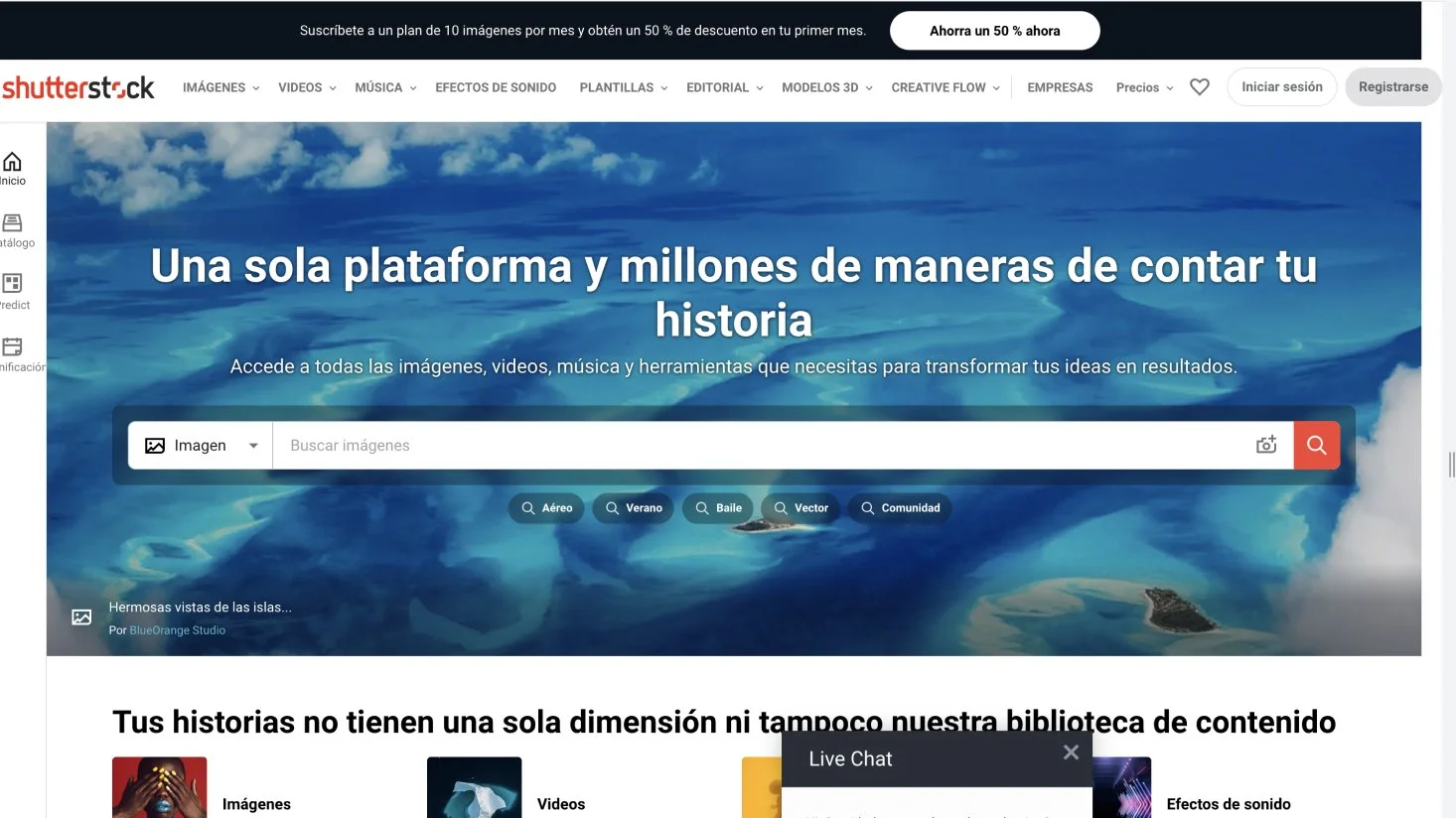
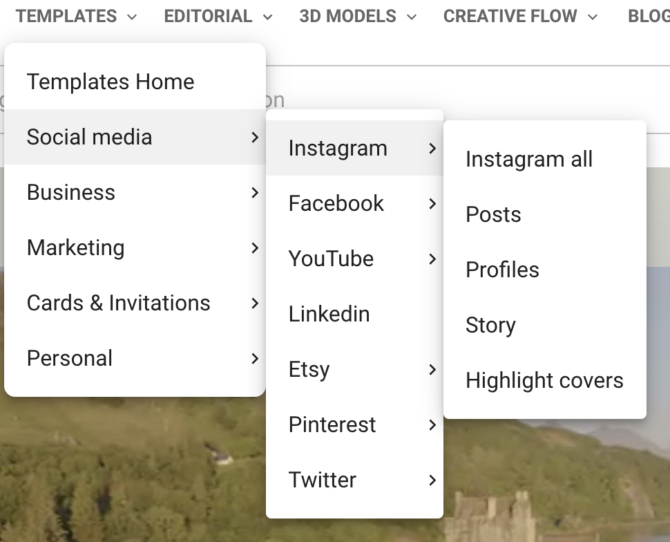
Throughout the pandemic with many changes in staffing and business priority at Shutterstock a lot of new products were added to the top level navigation without oversight from the UX design team. Some of the products added were new creative tools while our main products historically are digital creative and editorial assets. There was no dedicated team who owned and maintained the global navigation and as it’s very much top of the funnel it was not deemed important for conversion.
The pandemic era changes caused accessibility issues, technical bugs and a very bad user experience. Throughout this project I had to push leadership for developer support as well as the ability to use my time (how this was done described later).
I’m thrilled to report (spoiler) that through my leadership and work I contributed we were not only able to solve the problems but launch this complex company wide project.
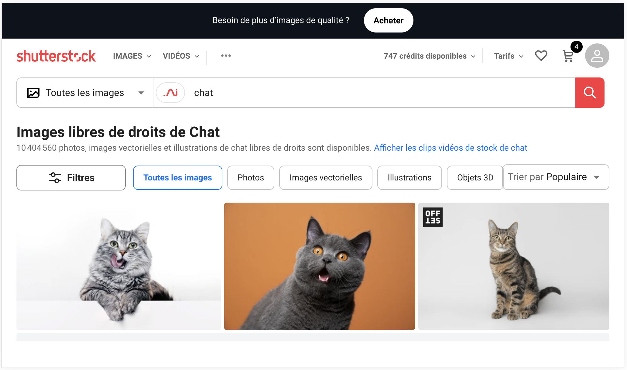
Lack of QA testing with each new addition for translations and screen size issues our navigation was severely broken for very common screen sizes when translated into longer languages such as French and Russian.
The information architecture was not taken into consideration with each new addition causing a certain level of cognitive dissonance for users trying to determine what shutterstock has to offer.
My role and the team
Product Design Lead - overseeing our “sell” division (encompasses any part of the site that isnt search, contributor or AI).
In this project I was responsible for strategy, stakeholder management, the end to end product design process, and company wide communication about the project.
The team - Due to the broad nature of this project it involved MANY teams including: UX design, Marketing, SEO, Customer care, and more.
Core team:
Product Design and Research -
Lead product designer - Bridget Workman
Senior product designer - Joshua Lee
Engineering -
Software engineer II - Cesar Colina Leal
Goals
We had many goals for this project:
Fix obvious bugs with longer translations and smaller screen sizes
Decrease cognitive load while increasing understanding of who we are and what we sell
Increase accessibility
Hypothesis:
Belief: We believe that the global navigation is cluttered and discourages users from exploring all we have to offer - we also believe that branded names may not be immediately recognizable by our users
Objective: Improve user experience and increase interest in Shutterstock offerings
Prediction: We believe that by better organizing the top nav / renaming some items, users will better find what they are looking for and/or explore other areas of the site
Expected outcome: If the hypothesis is true we expect clicks into the top nav to remain the same or increase and see and increase in session success rate.
Data
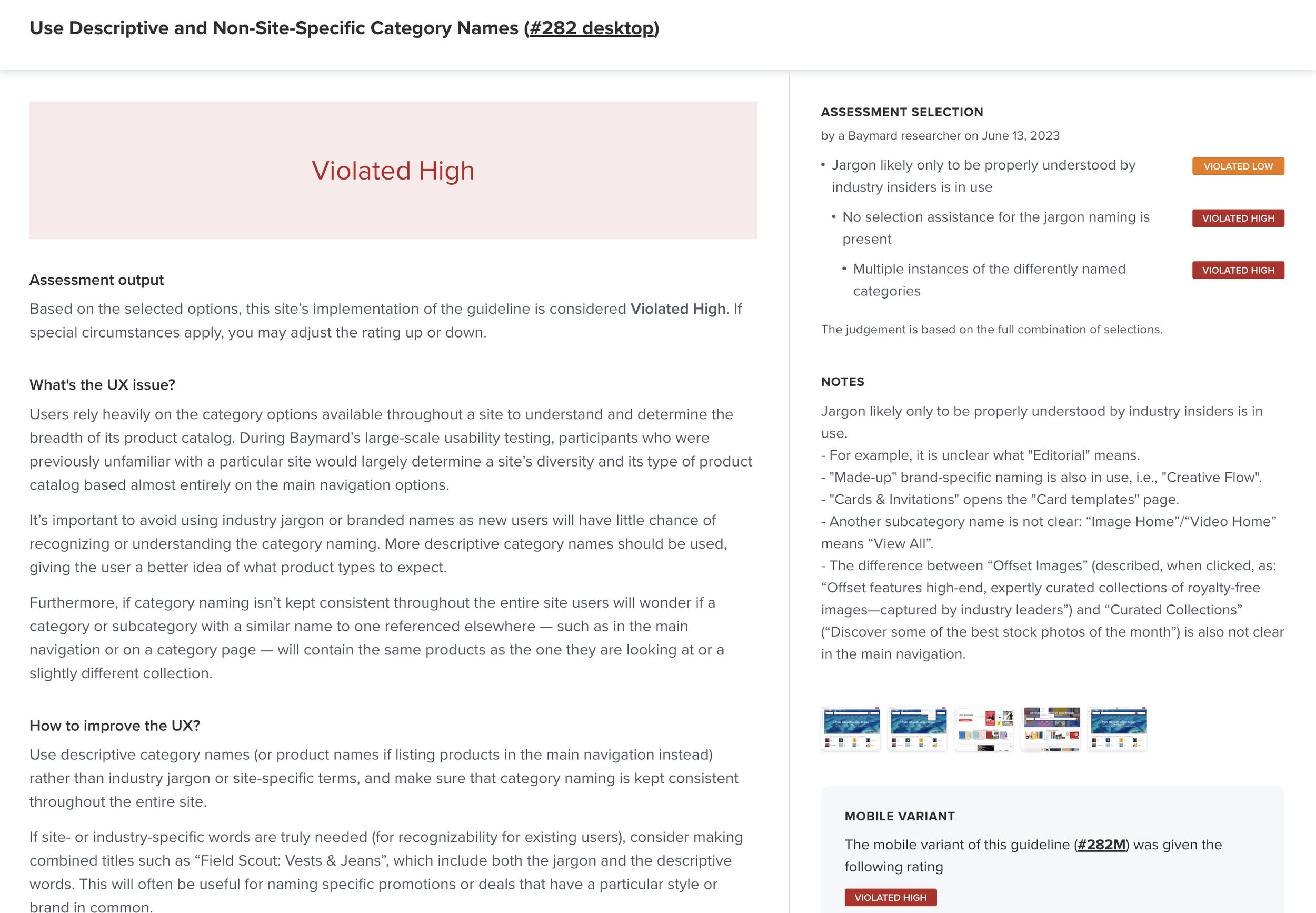
The global navigation at the time was lacking traditional quantitative data so we had a hard time knowing what users were clicking. What we did have was conversion data and access to a Baymard audit.
The Baymard Institute (I often refer to as “Baymard”) conducts user research on a massive scale to create statistically significant UX guidelines and best practices in the e-commerce industry.
Our Baymard audit clearly shows much needed UX improvements. Based on these UX best practices we endeavor to fix:
How we label our categories
Add a hover delay
Descriptions to our links
Highlighting the page the user is on
Competitive analysis
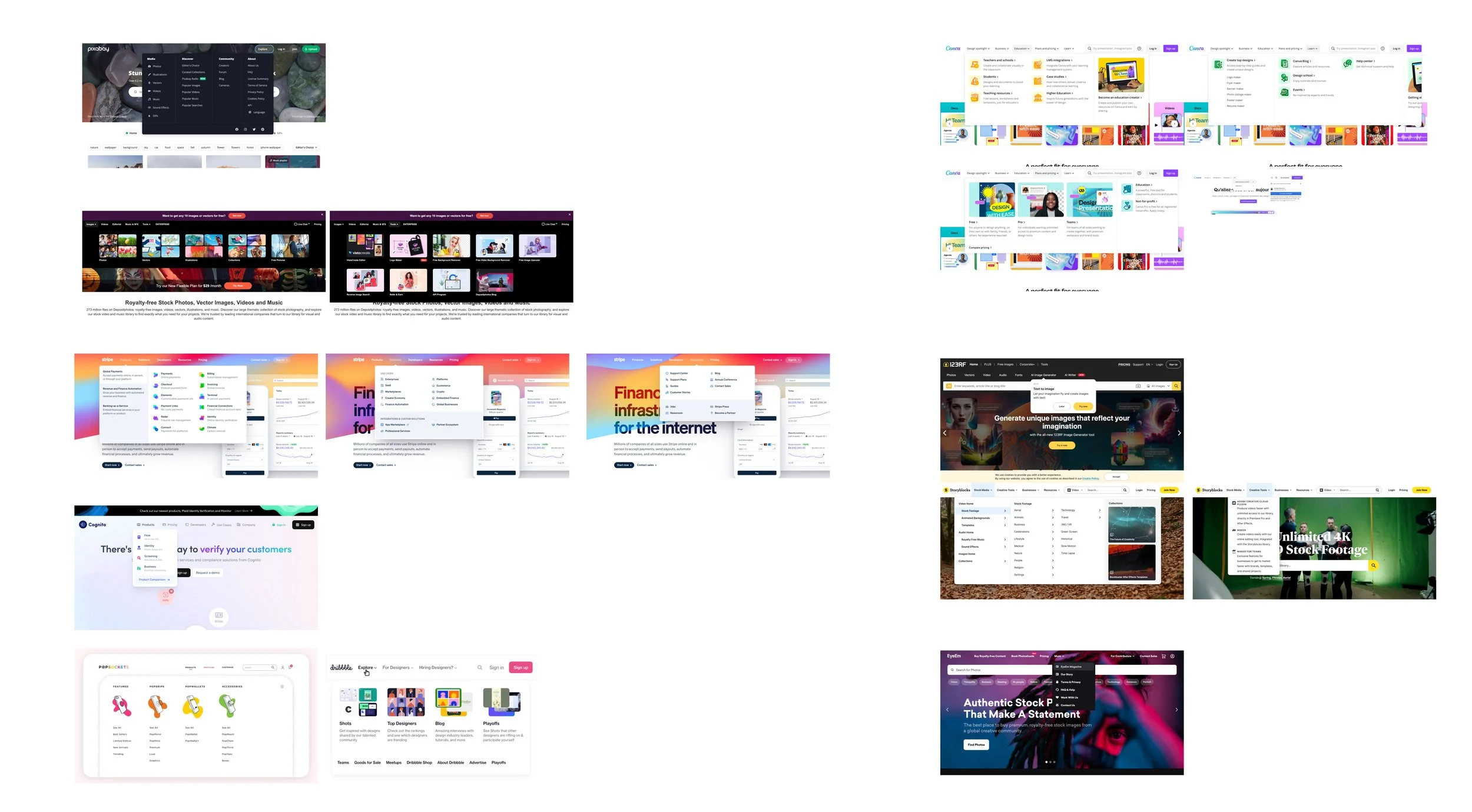
Based on baymard best practices the senior product designer Josh and I searched for examples that seemed to exude great UX. We found several we thought could work well for the content and product variety we have at Shutterstock.
Ideation
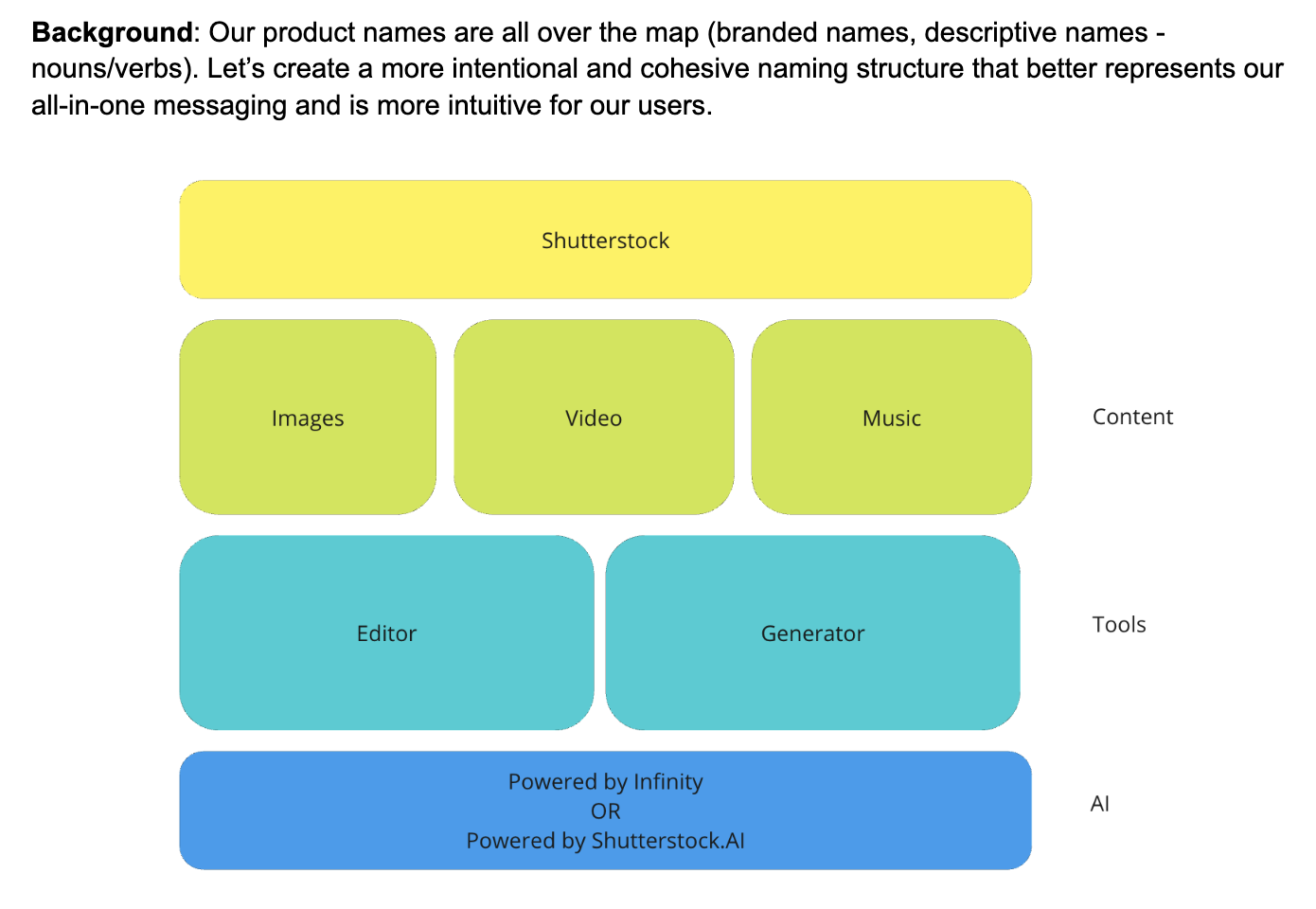
Starting with naming conventions Josh and I met with our Product Marketing team to ideate some testable options for categorizing our products.
As a group we came up with 3 concepts:
Concept 1: Descriptive, non-branded
Example: Content & Tools
Concept 2: Branded names
Example: Content library, Shutterstock.AI, Creative flow
Concept 3: Action based
Example: Browse, Design, Learn
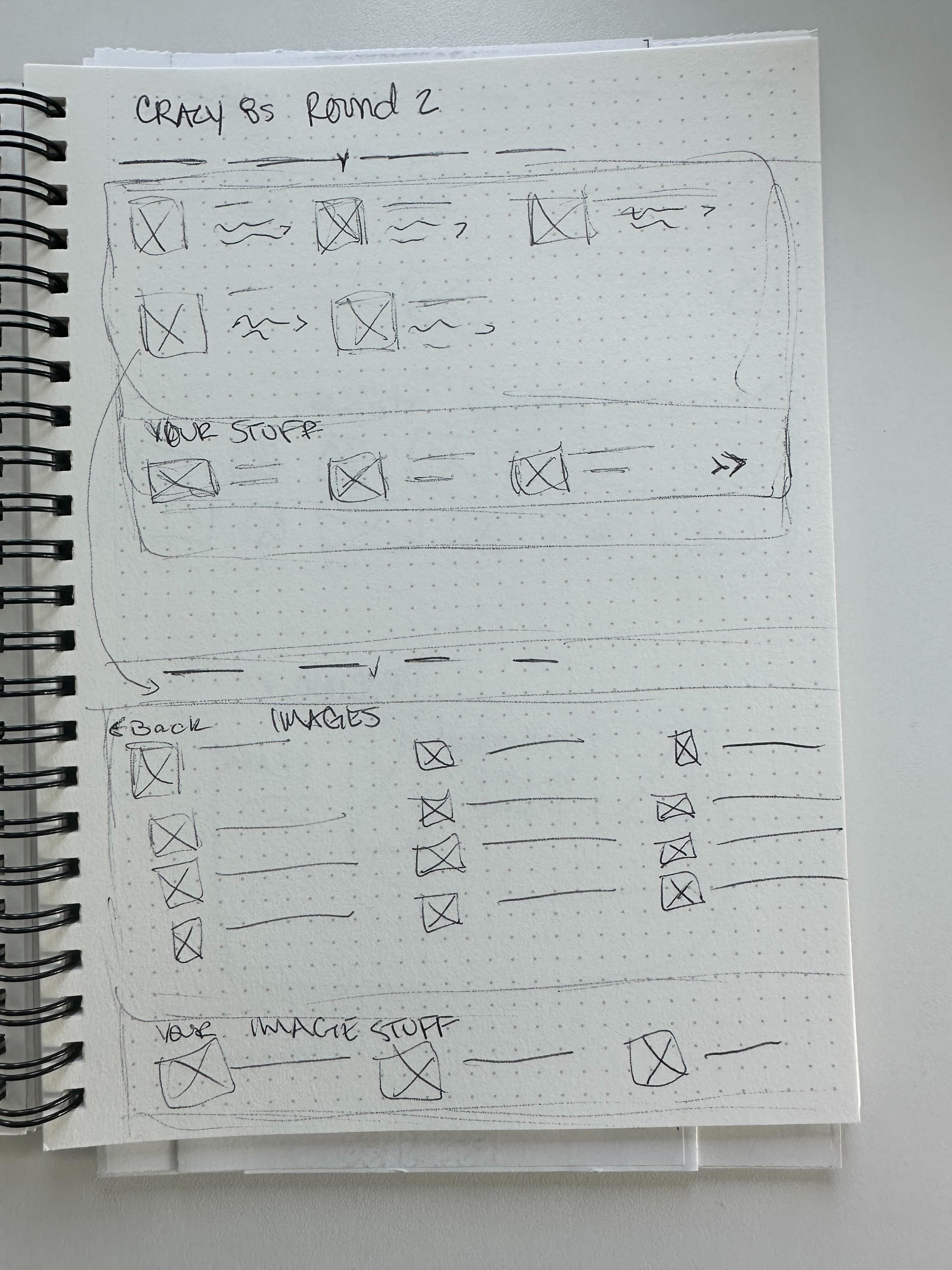
I ran an ideation session with a diverse group of co-workers, a few from product, product marketing, developers and ux design. We did a couple quick rounds of crazy 8s and uploaded them to Miro to vote for the sketches that would best work for our use case.
Quick wins with fast turn around
While the naming conventions were being discussed and the ideation sessions being held there were still some pretty glaring bugs that needed to be fixed to greatly improve user experience. We increased the hover delay to 500ms and increased the mouse over area so that it is easier for the user to navigate our current menu structure. We also created an overflow menu so that all options would be available on all screen sizes regardless of the language selected. These changes were deemed bug fixes and not a/b tested but clearly were a great improvement.
User testing and tree study
We took our top two ideas and created prototypes for users to test on UserZoom. For the study we had users complete 3 navigational tasks per prototype and a quick questionnaire with each. The navigational tasks asked the user to locate something specific to see if both the location and the category naming made sense. For example: “Click where you would expect to click to find music and video content.” Followed by “Is this where you expected to find it?” The final questionnaire had questions like “How useful or not useful are the descriptions an visuals in finding what you’re are looking for?”
While users found both prototypes easy to navigate they chose prototype 2 as the easiest. Due to this we decided to A/B test this design against our control.
Testing
Tested style: A/B testing
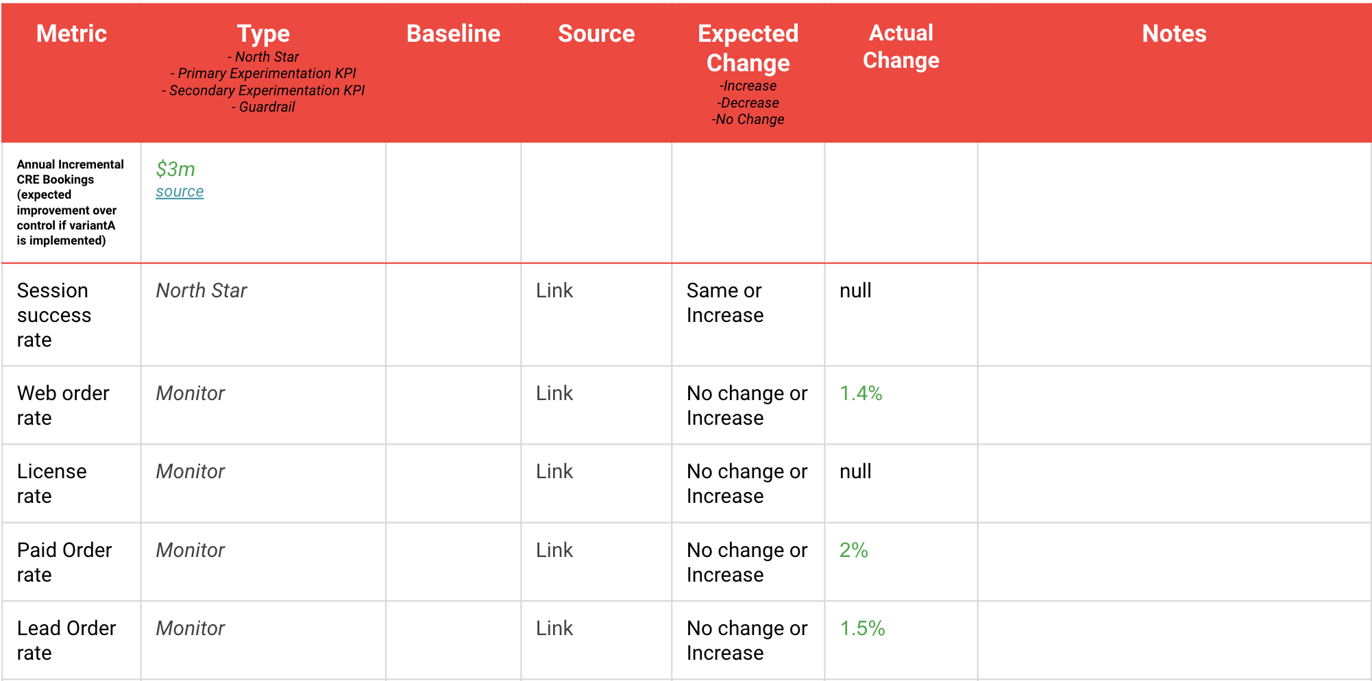
North Star Metric: Session success rate
Estimated Impact to North Star Metric: Same or increase
Primary Experimentation KPI: Web order rate
Device types: Desktop
Audience/Segment: All (Logged in and Logged out)
Page(s): All
Region(s): Global
Currencies: All
Languages: English (reduced time to test by not needing translations)
Traffic split: 50% Control, 50% Variant A
Desired Confidence Level: 80%
Measure
Results were flat. Taking into account the UX improvements and improvement to our Baymard score we opted to roll this test out to 100% of users.
Since running the test priorities have changed and the roll out has been placed on hold - to be rolled out as soon as possible.
Reflection
Was the project successful?
Yes, this project was overdue and needed a leader. I was glad to take on that role.
What did I learn?
Grew my stakeholder management skills in a big way. I’ve lead big projects involving multiple teams, but none as large as this one. Required a lot of coordination, give-and-take, and tact to complete.
What this project says about me.
Persistence and skill at creating connections when dealing with challenging tasks.


